OOPS!
お探しのページが見つかりませんでした。

お探しのページが見つかりませんでした。

Jan 18, 2021 Filed to: UI/UX Design Tips Proven solutions
An admin UI design for an administrator dashboard needs to have several key characteristics. It must be functional, it must contain all relevant information, and it must offer a superior admin UX or user experience. Since the admin UI design precedes the admin panel UX, great care must be taken to ensure that it serves the purpose for which it is being created. An admin dashboard is essentially like a central control point for users and tools in an ecosystem. It can be a simple activity dashboard showing how users are interacting with a particular system, or it can be an elaborate one that allows you to drill down into lower-level reports and gives you a comprehensive way to manage users, licenses, permissions, and other aspects.
Admin panel UI design is a highly evolved field, which means there are literally hundreds of design templates and live products that you can take ideas from. Here are some of the best admin UI design examples to show you what’s possible when you have a powerful admin UI design tool at your disposal.
This is as basic as it gets while being extremely useful. The example above is for inventory management and offers a solid mix of visual and data-based information. The clean layout makes it easy to understand the data being displayed, and the navigation is simplified by using tabs for each section. There are also interactive filters to help the admin drill down to the exact data set required.
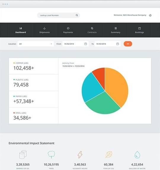
An admin panel UI doesn’t need to be flashy or have stunning visual elements. It can be as simple and functional as you want, like this one.
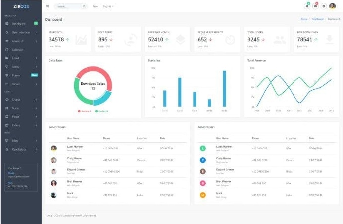
This admin UI is clearly designed to highlight important information about users and various statistics about them. The sidebar panel offers a convenient navigation tool to go from one page to another. It’s highly functional but also has attractive visual elements to give you a quick snapshot of a user’s statistics and other metrics.
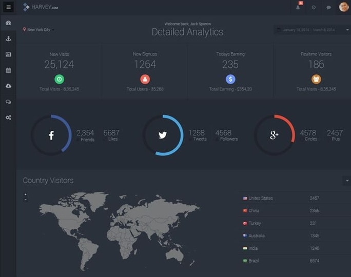
This web analytics admin UI has been designed with a dark theme that’s becoming increasingly popular. This particular one shows website analytics, with key metrics such as traffic source, user data, and so on. Notice the blend of visual and text data to give the admin a holistic view of the metrics like a snapshot frozen in time.
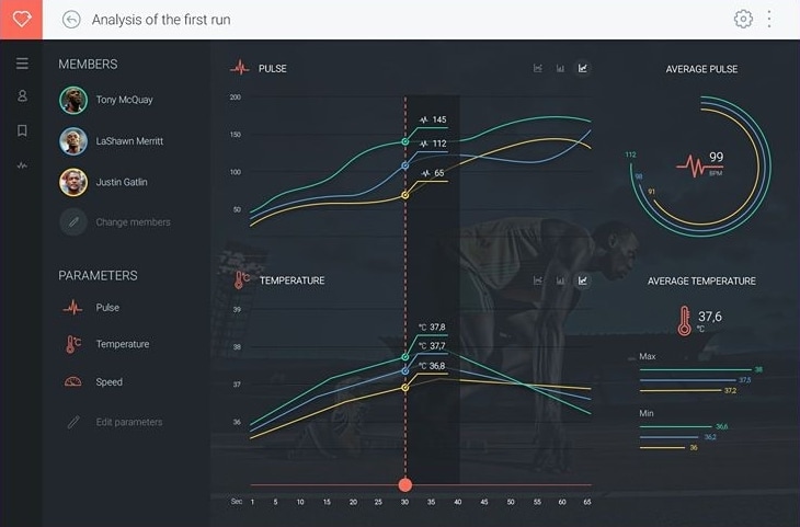
This is an athlete performance and training management admin panel that focuses more on visual aspects of the underlying data. This type of layout makes it easy to do comparisons and spot anomalies in an athlete’s normal performance trends while training and can give the trainer valuable insights into how the program should be modified or adjusted to suit the dynamic needs of an athlete.
This admin UI design example is perfect to show data changes over a specific timeframe. This also focuses on the visual element being the main conveyor of data, supported by clearly visible numeric data embedded in the visuals. A convenient collapsible menu in the sidebar panel on the right gives the user quick access to various metrics.
So, how do you create such a stunning admin UI design so it can be developed into a robust product? The key to this is working with the right UI design tool, and the one we’re showcasing here is Wondershare Mockitt, a versatile UI/UX design software for designing and prototyping stunning admin dashboard interfaces that are just like the examples you saw above.
[站点或者站点渠道数据配置有误]
It offers a ton of great features, some of which are listed below:
Creating admin UI design in Mockitt sets the right tone for a superior admin UX or user experience. Using dynamic widgets, links, transitions, and other effects, you can give life to your admin UI design by making the interactive for your stakeholders. The hi-fi prototypes you create in Mockitt will behave like a real application, giving them a clear picture of what the admin panel will look like and how the user can interact with it. Here are the basic steps to create an admin UI design on Mockitt online.
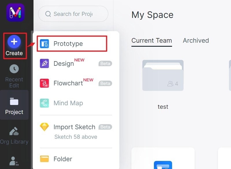
Step 1. After signing up with your email and logging into the Mockitt workspace, click on "Create" > "Project" and select the target device the app is intended for.
Step 2. Start adding widgets to the canvas by clicking the "Built-in" button. You can customize these widgets and add them to "My Widget" for reuse.

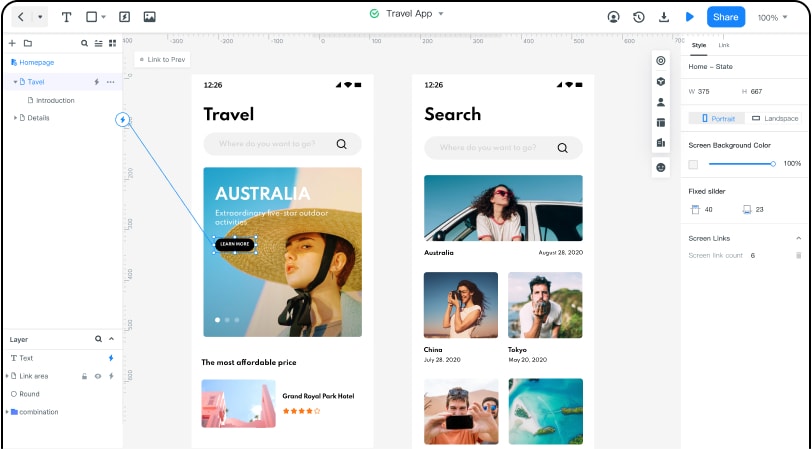
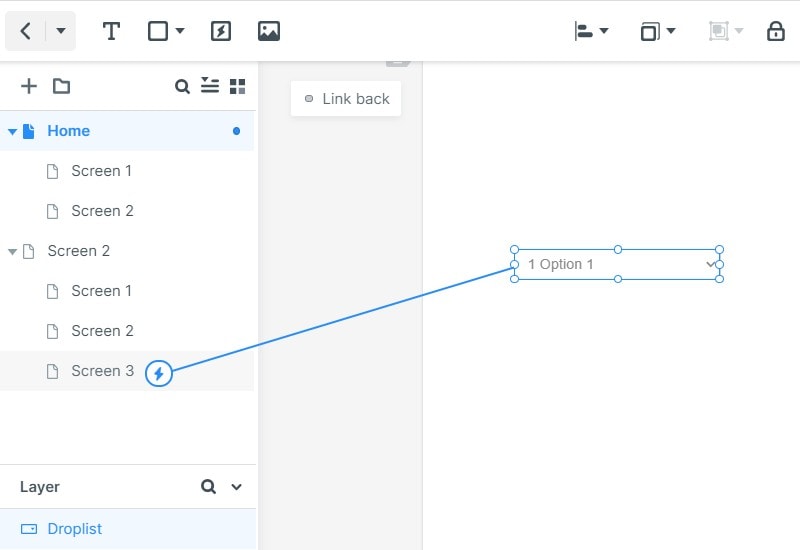
Step 3. Once the layout is set, you can drag the lightning bulb beside the widget to the target screen that you want to interact with. The links can be dragged from the widget to the page and edited to add transitions, gestures, and animation effects.
Step 4. If you have no idea about the admin dashboard layout, you can click "Built-in"--"More Resources" to get inspiration from some templates. There are lots of different kinds of templates in the "Resources" including admin UI design.
After you finish the design, click "Preview"--"Handoff", you can send the CSS code to the developers. They can inspect code and download component codes and specs as part of the handoff process. The designer doesn’t need to know any coding because all the HTML and CSS/Swift/Android style code is generated by Wondershare Mockitt at the back end.

[站点或者站点渠道数据配置有误]

Peter Martinez
chief Editor
Generally rated4.5(105participated)